
The Friendly Fridge Movement
Ourfood.nyc is a community food support group, one of the many that are leveling up the growing food movement. Through fundraising, organizing food distributions, and maintaining community fridges, they directly address food insecurity in New York City. There are currently over 90 independently run fridges in NYC, and more are plugging in across the country!
I began working with Ourfood.nyc over the summer of 2020. The volunteers are loving, friendly, compassionate humans. The final logo reflects the environment created when a community comes together to help one another. The visuals are friendly, simple, and drawn a little wobbly to serve as the raw, organic energy that exists in a fast-paced Brooklyn volunteer group.
services
Branding, Graphic Design, Illustration, Apparel Design, Merch Design, Web Design, Social Media Marketing
Volunteers and events were bright, fun, and lively. I intended the graphics and icons to be attentive towards that energy and the love and compassion that emits from honest mutual aid work.

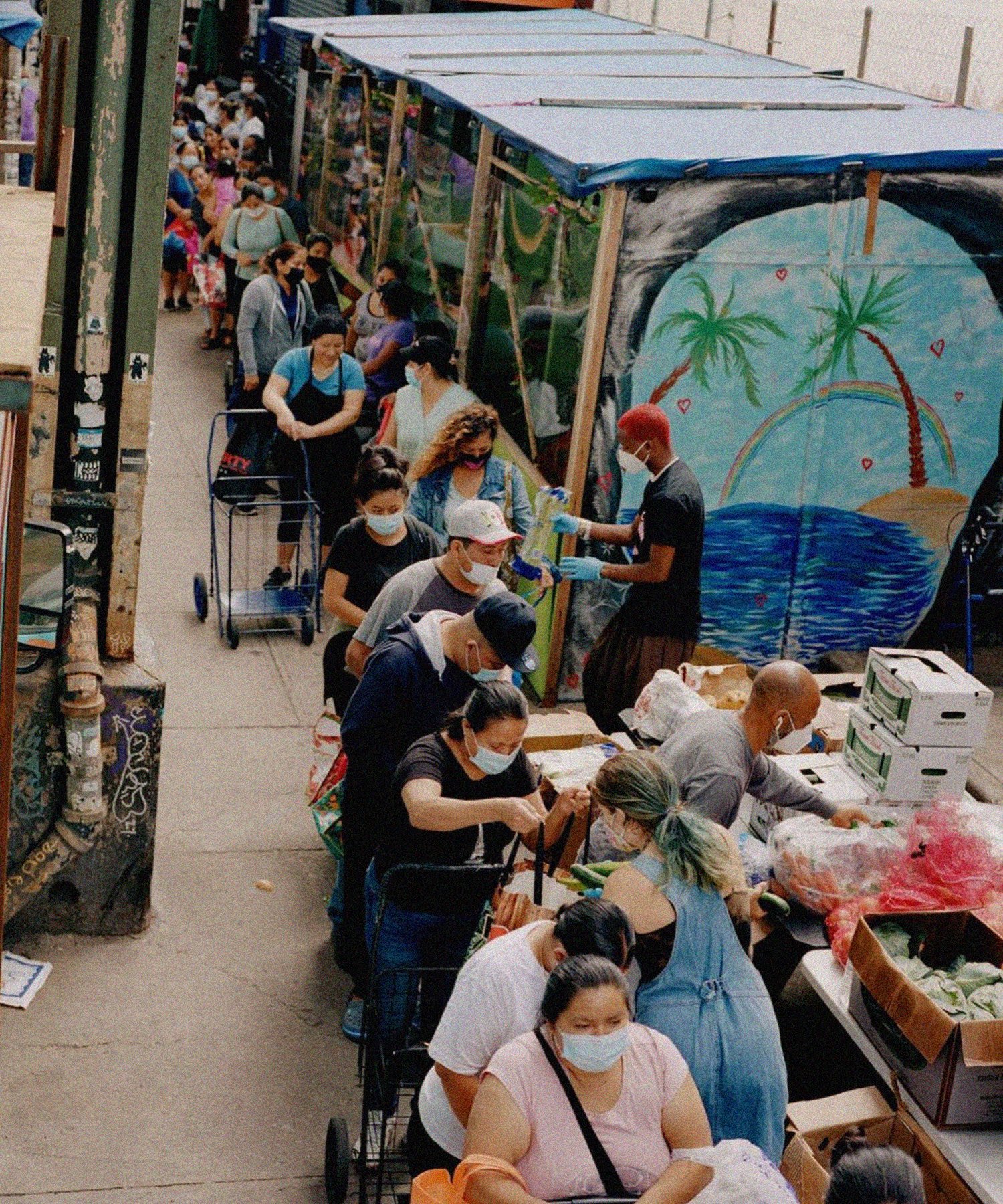
Visuals were intended to be cheery and approachable. Ourfood.nyc has this all-hands-on-deck mentality, where beauty lies in the imperfection and we are all working together to reach a common goal, with some volunteers having little to no experience. I paired that energy into more unstructured/wobbly visuals and a more neutral, easily-legible typography.
Research + Early Concepts
For initial concepts, I experimented largely with vegetables shapes because I was under the impression food was at the center of their work (food distributions, fridges, etc). After volunteering with them, I quickly learned that OurFood.nyc is more than working with food, it is working within the community and spreading love and accessible resources. We wanted to stray away from a food visual and more towards a general message of gratitude.
After speaking more in depth with volunteers and volunteering myself, I redirected the the visuals towards concepts that were fun-bubbly type specific and rainbow-specific. I was welcomed with smiles and wanted the logo to reflect that neighborly energy.